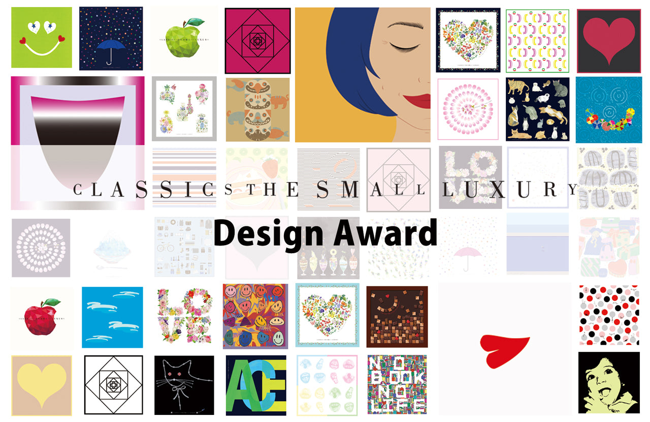
CLASSICS the Small Luxury Design Award 2023 Announces Winners
Award-winning works
- Grand Prix
Author:Komiyama Butei, Japan) Title: Drip

Jury Critique: "When I was trying to respond to the theme of "tears," I liked the way the artist cut out the image not in the form of a drop, but in the form of a tear that trickles down the cheek. I thought the way it was drawn and the colors, which showed the hand of the artist, were simple but had a lot of effort, which I thought made it appealing. The color pink is the color of the cheeks, and I thought it was a beautiful color and I would like to have it.
Runner-up
Author:SHIMOHIGOSHI NAOKI(Japan) Title: Tears from Sea n Land

Jury Critique:The moment I saw it,
Author:Kato 10,000Rina(Japan) Title: Sprout

Jury Critique:The lines are beautifully drawn and the square size is very well cropped,The cleanness of the handkerchief and the balance of the amount of drawing are very good.
| The Grand Prix and Runner-Up Prize winners' designs will be commercialized and sold at CLASSICS the Small Luxury directly-managed stores. We will announce the sales timing as soon as possible. |
- Jury's Special Prize
Author:Kande Ge Sbers, JapanTitle of work:My only dream

Jury Critique: Kanako Kajihara (President, KAJIHARA DESIGN STUDIO Co., Ltd. / Textile Designer)
With many tears. The theme of "With many tears" tells a story of "one person's life," and the design is so impressive that it made us wonder what happiness is in this world. The back of the handkerchief makes us wish for equal peace. Every time I use this handkerchief, I will be reminded of the small happiness and come back to gratitude.
Artist: Ayaka Kimura (Japan) Title: Yoroso

Jury Critique: Takashi Saito (Representative Director/Project Designer, Griffon Co., Ltd.)
My first impression is that the illustration is an animal motif that everyone thinks is "cute." I assume that the "various tears" in the theme is composed of polka dots, and the "togetherness" is interpreted as two animals cuddling up to each other, and that the design was created by separating the two. The theme of this year's exhibition is literally taken in a heavy direction, becoming too explanatory, and tending to be away from the charm (cute, cool, beautiful, etc.) of the "handkerchief," an item to be carried every day. This work reaffirms the purpose of this competition and the characteristics of the item.
Author: Abdurrahman Imaduddin (Indonesia) Title: raindrops

Jury Critique: Kaoru Takai (Graphic Designer, Sun-Ad Inc.)
The picture of the sun, ground, and rain looks like eyes, mouth, and tears. I thought the white hand-drawn lines that bring up various images were a wonderful design as an expression of "the world with tears. The delicate blue-gray color is also beautiful. There is a saying, "Seikou-rainou-ryou," and this handkerchief will make you feel relaxed when you take it out of your pocket and look at it.
Author: Asuka Enoki (Japan) Title: Blue, Lines, Tears and

Jury Critique: Tomohiro Nakayama (Graphic Designer, Sun-Ad Inc.)
I felt the innocence of the artist's approach to graphic design and the grace with which she took on the challenge of using typography to deal with a difficult theme. At first glance, it looks like a digital design, but the combination of subtly uneven circles gives it an analog look, and I thought it was a design that could be looked at for a long time. When folded, the impression becomes even more elegant, and I liked the fact that it can be enjoyed in a variety of ways.
Artist:Mio Harada (Japan) Title:A beautiful rain

Jury Comment: Kayoko Goto (Designer, CLASSICS the Small Luxury, Blooming Nakanishi Co.)
Author: Hosoya Katsumi (Japan) Title:still forward

Jury Critique: Hajime Nakanishi (President, Blooming Nakanishi Co., Ltd.)
There have been hard times, there have been sad times,


